Charts
Showing posts with label Charts. Show all posts

Catching up!

Sunday, May 24, 2020

No comments
I officially graduated from the Data Analytics and Visualization Bootcamp yesterday. It has been an amazing experience. I will write a full review on the course in my next blog post.

The past five months have been really hectic. When Covid-19 hit, everything had to change almost overnight. One day I am in a physical classroom, the next class we quickly had to shift to online classes. Suddenly my elementary age kids also had to do distance learning. We all had to scramble and adjust to the new norm. But despite the sudden changes, we were able to make it to the end of the bootcamp! 

Below are some of the projects I worked on since my last post. It's amazing to see how I've progressed in just six months. From not knowing anything about all these tools to seeing them working, is truly an accomplishment for myself. It wasn't easy for sure and there is so much more I need to learn. But with perseverance and hard work, anything is possible.


This project analyzes the weather of 500+ cities across the world of varying distance from the equator. The objective was to build a series of scatter plots to showcase the following relationships: Temperature (F) vs. Latitude, Humidity (%) vs. Latitude, Cloudiness (%) vs. Latitude, and Wind Speed (mph) vs. Latitude.

This site provides the source data and visualizations created using Pandas and Matplotlib with observable trends.


A Flask web application that scrapes various websites for data related to Mars, saves the information in a database using MongoDB and displays the information in a single HTML page.


An interactive website (using javascript, html, css, d3.js) displaying UFO sightings from January 1-13, 2010 which allows users to filter the table data for the following values:
1. `date/time`
2. `city`
3. `state`
4. `country`
5. `shape`


An interactive dashboard (using javascript, flask-sqlalchemy, plotlyjs, flask-api, Heroku) to explore the Belly Button Biodiversity DataSet


This project is an interactive scatter plot using D3.js.


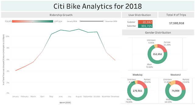
Citi-Bike Analytics

Interactive dashboards using Tableau and probably one of my favorite tools. I truly enjoyed creating all these visualizations.


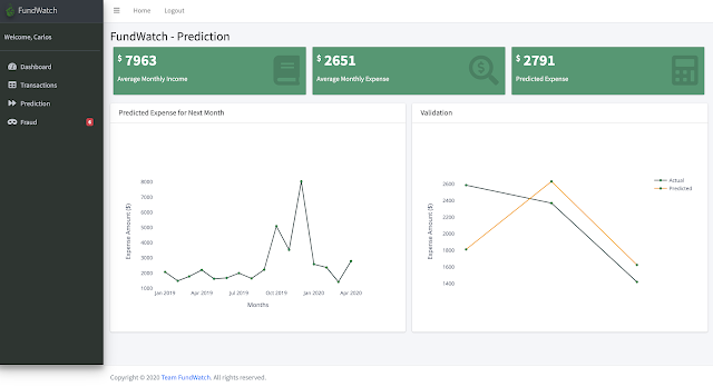
FundWatch (my second and third major project)

A personal expense tracker web app built with:

  • Python Flask
  • MySQL, PostgreSQL Database
  • Plotly for data visualization
  • HTML, CSS, Bootstrap, Javascript and D3 for front-end web development
  • Scikit-Learn (Isolation Forest Algorithm) for Fraud Detection
  • ARIMA Model for Expense Prediction
The original challenge of the project was to automate the process of manually tracking expenses. This was accomplished for project two via FundWatch - a web based expense tracking app. The second release of the app, project three, included user profiles, a login page and focused on how artificial intelligence can provide the user some insights on the next month's budget and possible fraudulent activities on past expenses. 

It was great teamwork between my group mate and myself to get these projects up and running. I had a vision of what I wanted this app to look like. With my group mate's experience as a developer, we were able to bring it to life! Shout out to you, Carlos, if you are reading this! It was a pleasure working with you! 


Read More

Why Oklahoma Shakes

Friday, January 24, 2020

No comments
To practice the skills we've learned since November (Python, Pandas, and Matplotlib), we were given our first project. Our team chose to work on analyzing why Oklahoma has been experiencing earthquakes more often than California. I was able to find good data sets from The University of Oklahoma Survey and the Oklahoma Corporation Commission, and a good API via the United States Geological Survey. Visit my GitHub for more details on this project.

My team's analysis show that waste water disposals are a big factor to the earthquakes. Below is a scatter plot on a map showing the location of disposal wells and earthquakes in Oklahoma.

Using a horizontal bar plot, we can see the comparison between the injection wells and seismic events on a county level. This data indicates that the number of wells does not correlate to the amount of earthquakes.
Same data used above on a scatter plot. The yellow dot represents Carter county, the red dot represents Grant county.
While there is no correlation between the number of wells and seismic event in a specific location, our analysis below indicates that there is a correlation between the waste water volume being injected and the amount of earthquake events. 


Read More

Black Friday

Sunday, December 1, 2019

No comments
I was always excited about Black Friday. The day I wake up really early to get in line at my favorite stores before they open to get the best deals of the day. Plus being super early means you get the best parking spots too! I finish 95% of my Christmas shopping on this day. But this year, for the first time in ten years, I stayed home! I got turned off at stores who started opening the evening of Thanksgiving day. I feel sorry for the workers who have to leave their families to go to work. All for more profit.

The data below shows the potential number of shoppers over the Thanksgiving weekend according to the National Retail Federation. Black Friday still shows as the most popular day to shop. Based on NRF's analysis, the top reasons consumers are planning to shop include:

1) The deals are too good to pass up (65 percent)
2) Tradition (28 percent)
3) It's when they like to start their holiday shopping (22 percent)
4) It's something to do over the holiday (21 percent)
5) It's a group activity with friends/family (17 percent)


So why did I skip the most popular day of shopping? In my experience, retail pricing have changed over the years on the items that I purchased the most - clothing, accessories and shoes. I find the sales throughout the year better than the Black Friday sales. One perfect example is Old Navy. They offered a 50% sale everything on Friday. They do this throughout the year already. Not for everything all at once, but at staggered times on different categories. They may have added an additional 10% off for early birds, but is it all worth the 5am wake up call? Driving in the dark, cold weather? Standing in long lines to checkout? I don't think so. Not anymore at least.

I've noticed the "before" pricing were purposely raised so even with a 50% discount (which sounds very appealing) looks like you are getting a deal, when in reality you are actually paying an amount very close to retail price. I know this because I've observed the pricing differences of certain items I was very interested in.

Bottomline is, shoppers are drawn to a sale. Advertising has led to the belief that Black Friday sales are the best. Perhaps for certain electronics, yes. But for regular items, you need to observe what sale you are actually getting. It really is not that great. I find the after Christmas sales are actually better if you were shopping solely for yourself.

Cyber Monday is coming up. Maybe I will browse to see some deals in my pajamas with a nice cup of coffee. Maybe I will be one of the 68.7M online shoppers. But really, the one question you should be asking yourself before buying anything is: Do I really need this??


Read More

Kickstart your chart

Saturday, November 16, 2019

No comments
Over $2 billion has been raised using the massively successful crowdfunding service, Kickstarter, but not every project has found success. Of the more than 300,000 projects launched on Kickstarter, only a third have made it through the funding process with a positive outcome.

Getting funded on Kickstarter requires meeting or exceeding the project's initial goal, so many organizations spend months looking through past projects in an attempt to discover some trick for finding success.

Based on a database of 4,000 past projects between 2009 to 2017, the two charts below (using Microsoft Excel) shows a count of how many campaigns were successful, failed, canceled, or are currently live.

Let's focus on the labeling, which do you think is more effective to your audience?

The Horizontal Bar Chart:

The Vertical Bar Chart:


Did you tilt your head to the left to read the labels on the bottom on the second image? Can you imagine your audience suddenly tilting their heads as soon as you present this data? That would be a funny sight. The horizontal bar chart on the other hand is a lot easier to read. This chart is especially useful if the category names are long such as those above. The text is written from left to right, as most people read, making the graph more legible for your audience. By the time they get to the data, they already know what it represents. I've also decluttered the chart by removing the border.

Read More