I officially graduated from the Data Analytics and Visualization Bootcamp yesterday. It has been an amazing experience. I will write a full review on the course in my next blog post.
The past five months have been really hectic. When Covid-19 hit, everything had to change almost overnight. One day I am in a physical classroom, the next class we quickly had to shift to online classes. Suddenly my elementary age kids also had to do distance learning. We all had to scramble and adjust to the new norm. But despite the sudden changes, we were able to make it to the end of the bootcamp!
Below are some of the projects I worked on since my last post. It's amazing to see how I've progressed in just six months. From not knowing anything about all these tools to seeing them working, is truly an accomplishment for myself. It wasn't easy for sure and there is so much more I need to learn. But with perseverance and hard work, anything is possible.
This project analyzes the weather of 500+ cities across the world of varying distance from the equator. The objective was to build a series of scatter plots to showcase the following relationships: Temperature (F) vs. Latitude, Humidity (%) vs. Latitude, Cloudiness (%) vs. Latitude, and Wind Speed (mph) vs. Latitude.
This site provides the source data and visualizations created using Pandas and Matplotlib with observable trends.
A Flask web application that scrapes various websites for data related to Mars, saves the information in a database using MongoDB and displays the information in a single HTML page.
An interactive website (using javascript, html, css, d3.js) displaying UFO sightings from January 1-13, 2010 which allows users to filter the table data for the following values:
1. `date/time`
2. `city`
3. `state`
4. `country`
5. `shape`
An interactive dashboard (using javascript, flask-sqlalchemy, plotlyjs, flask-api, Heroku) to explore the Belly Button Biodiversity DataSet
This project is an interactive scatter plot using D3.js.
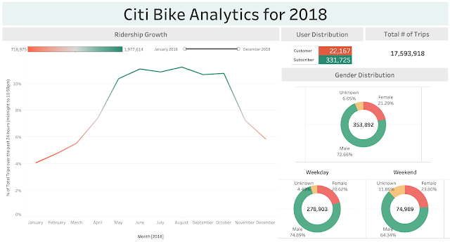
Citi-Bike Analytics
Interactive dashboards using Tableau and probably one of my favorite tools. I truly enjoyed creating all these visualizations.
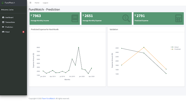
FundWatch (my second and third major project)
A personal expense tracker web app built with:
- Python Flask
- MySQL, PostgreSQL Database
- Plotly for data visualization
- HTML, CSS, Bootstrap, Javascript and D3 for front-end web development
- Scikit-Learn (Isolation Forest Algorithm) for Fraud Detection
- ARIMA Model for Expense Prediction
The original challenge of the project was to automate the process of manually tracking expenses. This was accomplished for project two via FundWatch - a web based expense tracking app. The second release of the app, project three, included user profiles, a login page and focused on how artificial intelligence can provide the user some insights on the next month's budget and possible fraudulent activities on past expenses.
It was great teamwork between my group mate and myself to get these projects up and running. I had a vision of what I wanted this app to look like. With my group mate's experience as a developer, we were able to bring it to life! Shout out to you, Carlos, if you are reading this! It was a pleasure working with you!


No comments
Post a Comment